An excellent question. In my not-very-humble-but-quite-accurate opinion, if you don't have experience in graphic design, you're better off hiring someone, even if you have a limited budget. Classic platitudes notwithstanding, people do judge a book by its cover and when those people can't pick the thing up and hold it, the cover is even more important. (If you're doubtful, search on "do ebook covers matter" and try to find a credible argument to the contrary.)
As an indie author, you can't expect readers to take you seriously if you don't take yourself seriously. That means a professional cover. (And a professional copyedit, but that's another blog post.) That doesn't mean you have to spend a lot of money. I've seen some very nice covers done for under $100.
However, whether you pay someone else or do it yourself, there is one detail that is critical for the success of a cover.
How does the cover look in the sizes that readers will see it online?
When evaluating covers, it's common to view them full screen in high resolution, but online shoppers are going to see lo-res thumbnails in search results. If you have a beautiful cover that is indecipherable at 85x115 pixels, it's not much use to you.
Amazon uses images at 56x86, 85x115, and 190x260, the middle size being the one returned in search results. Check your cover concept at all three sizes.
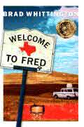
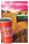
Since I was not the publisher of the Fred books, I didn't see the early cover concepts. However, the final covers, designed by Brand Navigation, turned out fairly well in thumbnail, with clear images and the title legible on the first and third in the series. The second, not so much.

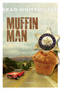
Consider these cover concepts for Muffin Man, designed by Amanda Cobb. Both looked great in print size (6x9 inches). In thumbnail size, the images on the first are fairly clear, but the title is difficult to read. In the second the title is very legible, but it's hard to make out what's going on in the image.

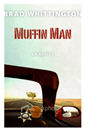
We found a good compromise in the third, and final, cover concept. Both image and title are clear and legible.
Now more than ever, covers matter, and when it comes to covers, size matters, especially the smaller ones.
Brad Whittington is the author of the Fred trilogy, What Would Jesus Drink? and the soon-to-be released Muffin Man.